Q&A: a web designer talked to us about the Boar’s new website
Remember when the Boar got really worked up about the Uni rebrand?

A couple of days after the Hoar launched, the Boar released an update to its website. I tracked down an actual web designer and we chatted about it on Facebook.
Q: What do you think of it?
A: It’s a big improvement. It works on mobile devices, which probably account for about half of their views — so that’s important. Structurally, it’s a very strong base. It still makes me cringe a bit though.
Q: Could you tell me a bit about yourself?
A: I’m a Warwick student with about six years of web design and graphic design under my belt. I liked the idea behind the new Uni logo last year. I’ve done work for a bunch of societies at Warwick, but I freelance properly when I have time.
Q: So what do you commend about the Boar’s new presence?
A: Like I said, being responsive [suitable for different screen sizes] is very important. The main navigation menu is a nice touch. The design seems to be their own work, not something derivative, which is nice too. The headlines look good in PT Serif — it’s a neat allusion to their print edition. Also, it’s very similar to the Guardian’s custom headline type. It’s a really big improvement.
Q: What would you do differently?
A: I think I’ve got three important criticisms.
Q: Do you want to take us through them one by one?
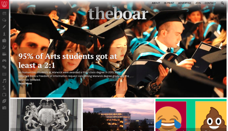
A: Sure. First, the design is very image reliant. That’s not a bad thing in a magazine, where every article comes with its own, directly relevant and (hopefully) visually interesting photography. Newspapers have it harder. A story like the one leading today, about arts students’ grades, will never come with a very helpful image.
Finding some suitable stock image probably makes the article more interesting, and it’s really helpful for Facebook shares, but I wouldn’t have given those photos such prominence on the website. A lot of them are pretty crappy.
Q: So what? You’d make them smaller?
A: Yeah. Mainly on the homepage — they layered almost all the text over images. I don’t think that’s necessary.
Q: Ok, next?
A: I’m a typeface obsessive…
Q: Fonts?
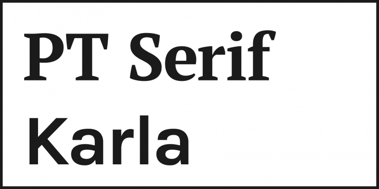
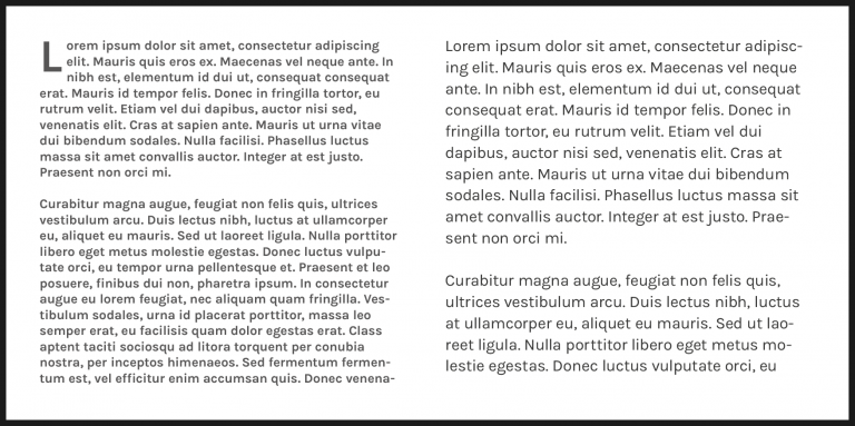
A: Yeah, fonts. I like both of their choices. Headings are in PT Serif, paragraphs and meta are in Karla. They don’t work insanely well together, but they’re both available for free, which is a big thing when you consider that a type family can easily cost over £600, or a hefty monthly subscription if you want to use them online. I think it’s a good compromise.

The Hoar uses Karla too. I like it very much — Bowie used a really similar typeface on his final two albums. It’s got class.
What would I change? They’ve used Karla in bold for their paragraph text, which is a really weird decision. I mean, you wouldn’t submit an essay in bold. That’s one thing I would really change, and quickly. Also, they should increase the size of that paragraph text a little bit.

I like the headlines in PT Serif. I might have used it in regular rather than bold though — the bold weight looks a bit dodgy anywhere in that one. I think it’s because it was drawn for the Cyrillic alphabet. That fucked it up a bit. My main objection is that they use it in all caps in a couple of places. That looks terrible.


Q: Cool. You’ve got one more?
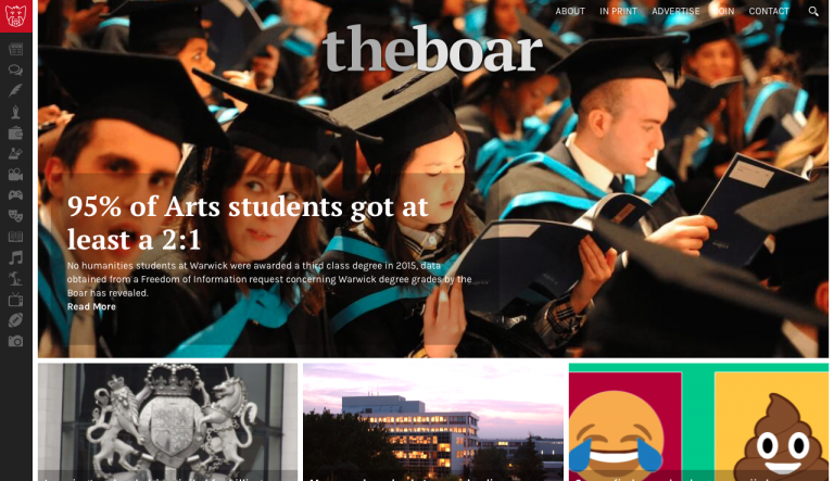
A: Yeah, kind of. They’ve used a lot of — I mean a shit ton of — shadow effects. Shadows were really, really cool in about 2007 and are really, really not cool now. I’ll send you some screenshots to show what I mean.

They make the whole thing seem really heavy, and quite dark. Dark like a dark alleyway way, not a romantic dinner way.
It’s hard to explain what I don’t like about them, but I wouldn’t have given any of the site’s elements a shadow. I’ll send a screenshot with all the shadows switched off. It’s better. Gradients too.

Q: Gradients?
A: Remember opening up the MS Word WordArt window in IT lessons? Yeah, that. They have a few prominent gradients. They just make it all look more complicated.
Oh, forgot to mention share buttons. They have a lot of share buttons. Like eight, with two each for Facebook and Twitter. They probably could get away with fewer. No one uses Google+.
Q: Haha. Sharing is our lifeblood. Probably theirs too. Can you summarise?
A: I like what they’ve done. It’s a site with a really strong structure, and I reckon they’ll be able to keep it relevant with small edits for a good few years.
It’s a bit too busy for my taste, and someone has made some really bad (but easily fixable) typographical decisions.
Basically, it’s about three tweaks from — in my mind — being close to perfection.
Q: Which website is better? Hoar or Boar?
A: No comment.
Q: That’s not promising. Cheers though.
A: Thanks, Theodora.